The feature is complete. The pull request has been approved, the visual design matches the mockups, and QA has tested the happy path.
Then someone runs an accessibility audit.
Suddenly, the team finds icon buttons without names, inputs without labels, keyboard traps, invisible focus indicators, and a dialog that sends focus back to the top of the page when it closes. The release is delayed while developers retrofit accessibility into components that were never designed for it.
This is a familiar pattern because accessibility is often treated as a validation step at the end of development. We build the experience first and ask whether everyone can use it later.
The better approach is to treat accessibility as part of engineering from day one. It should influence how a component is designed, which HTML elements we choose, how interactions behave, what the team tests, and what the delivery pipeline allows into production.
In this article, we will explore:
- Why accessibility is a product and engineering concern
- How to build accessible components from the first line of code
- Practical accessibility habits developers can use every day
- Tools for testing components and complete user flows
- How to create an accessibility-first mindset across a team
- How to enforce accessibility without turning it into a last-minute gate
Why Accessibility Matters
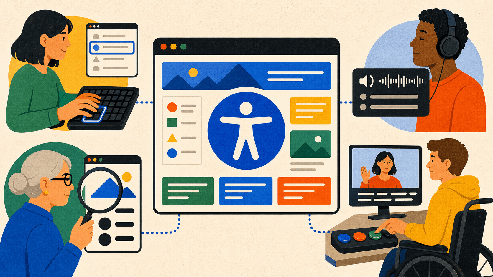
Accessibility is about whether people can perceive, understand, navigate, and interact with a product. That includes people who use screen readers, keyboards, voice control, screen magnification, switch devices, captions, or other assistive technologies.
It also includes situations that many of us experience temporarily:
- Using a laptop with a broken trackpad
- Watching a video where audio is not appropriate
- Reading a screen in bright sunlight
- Recovering from an injury that limits movement
- Trying to understand an unclear error message while under pressure
- Using a small screen or zooming in to read comfortably
Accessibility improvements frequently make an interface more resilient for everyone. A properly labelled input is easier to understand. A visible focus indicator makes keyboard navigation predictable. Clear error messages help every user recover. Semantic HTML works better across browsers, input methods, and assistive technologies.
There is also an important engineering reason to start early: accessibility is much cheaper to preserve than to retrofit.
Changing a color token before dozens of components depend on it is straightforward. Replacing a custom clickable div after multiple applications have built behavior around it is not. Fixing focus management inside a shared dialog improves every consumer; repairing it separately in every product creates duplication and inconsistent behavior.
The Web Content Accessibility Guidelines (opens in a new tab) provide a shared standard for accessible web content. They are essential reference material, but accessibility work should not begin and end with conformance. Passing individual criteria does not automatically make a workflow understandable, and a failing experience still affects a person even if no automated tool detects it.
The real goal is to build products that more people can successfully use.
Shift Accessibility to the Beginning
Teams often discuss a component in terms of its visual appearance and business behavior:
- What does it look like?
- Which props does it accept?
- What happens when it is clicked?
- How does it behave on mobile?
An accessibility-first team expands that conversation before implementation begins:
- What is this component semantically?
- What is its accessible name?
- How will someone operate it without a pointer?
- Where does keyboard focus move when its state changes?
- How will assistive technology understand its state?
- Does it still work when text is resized or the viewport is narrow?
- Are instructions and errors communicated by more than color?
- What happens when loading fails or content is empty?
These questions form the component's accessibility contract.
For example, the contract for a dialog might say:
- It has a visible title that also provides its accessible name.
- Opening it moves focus to an appropriate element inside it.
TabandShift+Tabdo not move focus into the page behind it.Escapecloses it unless closing would cause data loss without confirmation.- Closing it normally returns focus to the element that opened it.
- Background content cannot be interacted with while it is modal.
- The dialog remains usable at increased zoom and on narrow screens.
This is not QA documentation added after the component is complete. It is part of the component specification.
If accessibility changes how a component behaves, it belongs in the design and API—not in a checklist at the end.
Build Accessible Components from the First Line
Accessible components do not begin with ARIA attributes. They begin with the correct platform primitives.
Start with semantic HTML
Consider a custom clickable element:
<div className="button" onClick={saveChanges}>
  Save changes
</div>
It may look like a button, but the browser does not treat it as one. It is not included in the normal keyboard tab order and does not provide the expected keyboard activation behavior or button semantics.
We could add a role, tabIndex, and keyboard handlers. Or we could use the element that already has those behaviors:
<button type="button" className="button" onClick={saveChanges}>
  Save changes
</button>
Native HTML gives us a strong foundation:
- Use a
buttonfor an action. - Use an anchor with an
hreffor navigation. - Associate a
labelwith a form control. - Use headings to describe document structure.
- Use lists for groups of related items.
- Use a table for tabular data—not merely to create a visual grid.
ARIA is valuable when native HTML cannot express a complex widget, but it does not automatically implement its behavior. The W3C's ARIA Authoring Practices Guide (opens in a new tab) makes this distinction clear: when we build custom GUI components with ARIA, we are responsible for implementing their keyboard support.
Give every control a useful name
Sighted users may understand an icon from its shape and surrounding context. A screen reader needs a programmatically determinable name.
// The icon name may be announced poorly—or not at all.
<button type="button" onClick={deleteProject}>
  <TrashIcon />
</button>

// The action now has a clear accessible name.
<button
  type="button"
  aria-label="Delete project"
  onClick={deleteProject}
>
  <TrashIcon aria-hidden="true" />
</button>
When visible text already describes a control, let that text provide the accessible name. This keeps the visible and non-visual interfaces aligned. Use aria-label for cases such as an icon-only button where there is no visible label to reference.
The W3C recommends using native HTML naming mechanisms—such as label for form controls and caption for tables—where possible. It also emphasizes that interactive elements need useful accessible names, not merely names that satisfy a validator. See Providing Accessible Names and Descriptions (opens in a new tab) for detailed guidance.
Make component APIs carry accessibility information
A reusable component should make the accessible path obvious:
type IconButtonProps = {
  label: string
  icon: React.ReactNode
  onPress: () => void
}

function IconButton({ label, icon, onPress }: IconButtonProps) {
  return (
    <button type="button" aria-label={label} onClick={onPress}>
      <span aria-hidden="true">{icon}</span>
    </button>
  )
}
Making label required prevents the most common misuse. The consumer does not need to remember which ARIA attribute to add or how the icon should be hidden.
The same idea applies to more complex components:
FormFieldcan connect its label, description, and error automatically.Dialogcan require a title and own its focus behavior.Tabscan create the relationships between tabs and panels.Toastcan choose the correct live-region behavior based on urgency.Tooltipcan ensure that essential information is available without hover.
Accessibility becomes more reliable when component APIs carry intent instead of exposing raw implementation details.
Treat keyboard behavior as functionality
Keyboard support means more than adding tabIndex={0}. A person must be able to reach a component, identify it, operate it, and continue to the next task.
Simple native controls already define much of this behavior. Composite widgets require additional interaction models. For example, the WAI-ARIA patterns document expected key behavior for tabs (opens in a new tab), menus (opens in a new tab), toolbars (opens in a new tab), and other widgets.
Do not invent a new keyboard model merely because it is technically possible. Consistency lets users apply interaction patterns they already know.
Treat focus as application state
Focus is easy to ignore because pointer users can click wherever they want. Keyboard and screen-reader users experience the application in a sequence. When the interface changes, that sequence has to remain meaningful.
Ask deliberate questions:
- When a dialog opens, which element receives focus?
- When it closes, where does focus return?
- After an item is deleted, what is the next logical target?
- When form submission fails, how does the user find the errors?
- When new content appears, does it need an announcement or a focus change?
- Can a sticky header or cookie banner cover the focused element?
WCAG 2.2 includes an AA success criterion requiring that an element receiving keyboard focus is not entirely hidden by author-created content. This is especially relevant for sticky headers, fixed footers, and overlays. See Focus Not Obscured (opens in a new tab).
Focus movement should communicate a meaningful change of context, not surprise the user. Not every update needs focus. Sometimes an aria-live status message is more appropriate. The important part is that the behavior is intentional and tested.
Example: An Accessible Dialog Contract
A dialog is a useful example because it connects semantics, naming, keyboard behavior, focus management, and testing.
Here is a simplified React component built on the native dialog element:
import { useEffect, useId, useRef } from 'react'

type DialogProps = {
  open: boolean
  title: string
  children: React.ReactNode
  onClose: () => void
}

export function Dialog({ open, title, children, onClose }: DialogProps) {
  const dialogRef = useRef<HTMLDialogElement>(null)
  const closeButtonRef = useRef<HTMLButtonElement>(null)
  const previouslyFocusedRef = useRef<HTMLElement | null>(null)
  const titleId = useId()

  useEffect(() => {
    const dialog = dialogRef.current
    if (!dialog) return

    if (open && !dialog.open) {
      previouslyFocusedRef.current =
        document.activeElement instanceof HTMLElement ? document.activeElement : null

      dialog.showModal()
      closeButtonRef.current?.focus()
    }

    if (!open && dialog.open) {
      dialog.close()
      previouslyFocusedRef.current?.focus()
    }
  }, [open])

  return (
    <dialog
      ref={dialogRef}
      aria-labelledby={titleId}
      onCancel={(event) => {
        event.preventDefault()
        onClose()
      }}
    >
      <h2 id={titleId}>{title}</h2>
      <div>{children}</div>

      <button ref={closeButtonRef} type="button" onClick={onClose}>
        Close
      </button>
    </dialog>
  )
}
This example deliberately starts with a native element because showModal() supplies modal behavior and prevents interaction with the rest of the document while the dialog is open. The component also:
- Requires a title
- Connects the title to the dialog's accessible name
- Moves focus inside when opened
- Handles
Escapethrough the dialog's cancel event - Returns focus to the previous element when closed
- Uses a real button for the close action
It is still only a starting point. A production dialog must account for animation, nested overlays, content that changes, destructive actions, initial-focus strategy, unmounting, browser behavior, and application-specific requirements. For long or complex content, focusing the close button may not be the best choice. The WAI-ARIA dialog pattern (opens in a new tab) discusses how initial focus should depend on the dialog's content and purpose.
The lesson is not that every team should write a dialog from scratch. The lesson is that one well-tested shared primitive can own this complexity so every feature team does not have to rediscover it.
Accessibility Practices for Everyday Development
Accessibility includes many detailed criteria, but a relatively small set of habits prevents a large class of common problems.
Preserve visible focus
Never remove an outline simply because it conflicts with the design. Replace it with a focus indicator that is easy to perceive across every supported theme and surface.
Use :focus-visible when you want to show a strong indicator for keyboard-like interaction without necessarily displaying it after every pointer click:
.button:focus-visible {
  outline: 3px solid var(--color-focus-ring);
  outline-offset: 3px;
}
Treat focus color, width, and offset as design tokens. Test the combinations rather than approving each value in isolation.
Connect form instructions and errors
Form fields should expose their label, description, validity, and error relationship programmatically:
import { useId } from 'react'

function EmailField({ error }: { error?: string }) {
  const inputId = useId()
  const hintId = `${inputId}-hint`
  const errorId = `${inputId}-error`

  return (
    <div>
      <label htmlFor={inputId}>Work email</label>
      <p id={hintId}>Use the address associated with your company.</p>

      <input
        id={inputId}
        name="email"
        type="email"
        aria-invalid={Boolean(error)}
        aria-describedby={error ? `${hintId} ${errorId}` : hintId}
      />

      {error && <p id={errorId}>{error}</p>}
    </div>
  )
}
Do not use placeholder text as the only label. It disappears during entry, is often visually subtle, and does not replace a properly associated label.
Do not rely on color alone
An error field can use a red border, but it also needs text or another perceivable indicator. A chart can use color, but it may also need patterns, labels, or distinct markers.
Your token system should validate meaningful pairs such as:
- Primary text on page background
- Muted text on elevated surfaces
- Link text within body copy
- Error text on error surfaces
- Focus indicators around interactive components
- Disabled content in every theme
For WCAG 2.2 Level AA, normal text generally needs a contrast ratio of at least 4.5:1, while large text needs at least 3:1. The complete requirements and exceptions are documented in Contrast (Minimum) (opens in a new tab).
Support zoom, reflow, and text resizing
An interface that passes at its default size can fail when text is enlarged. Avoid fixed heights around text, clipped labels, and layouts that require two-dimensional scrolling unnecessarily.
Test components with longer translated content, browser zoom, narrow viewports, and increased text size. These checks reveal assumptions that perfect design-system examples often hide.
Respect motion preferences
Animation can provide useful context, but it can also make an experience uncomfortable or unusable. Respect the user's reduced-motion preference:
@media (prefers-reduced-motion: reduce) {
  *,
  *::before,
  *::after {
    scroll-behavior: auto;
    animation-duration: 0.01ms !important;
    animation-iteration-count: 1 !important;
    transition-duration: 0.01ms !important;
  }
}
A global fallback can reduce unexpected motion, while individual components can provide more thoughtful alternatives that preserve context without large movement.
Test every state
The default state is rarely the whole component. Accessibility behavior must survive:
- Hover and focus
- Selected and expanded
- Loading and empty
- Invalid and successful
- Disabled and read-only
- Light, dark, and high-contrast themes
- Short and long content
Many accessibility regressions live in the states that component documentation forgets to show.
Test Accessibility in Layers
No single tool can validate accessibility. The most effective workflow combines fast automated feedback with manual interaction testing.
1. Checks while writing code
Static lint rules catch problems before the application even runs. In React projects, eslint-plugin-jsx-a11y can identify patterns such as missing alternative text, invalid ARIA attributes, and event handlers placed on non-interactive elements.
Linting is useful because feedback appears close to the mistake. It cannot determine whether an accessible name is meaningful or whether focus moves to a sensible place, but it is excellent at preventing known code patterns from spreading.
During development, also inspect the browser's accessibility tree. It shows the roles, names, states, and relationships exposed to assistive technologies. This is often more informative than staring at the DOM and assuming an ARIA attribute produced the intended result.
And perform the simplest manual test available: put the mouse aside and use the keyboard.
2. Component-level checks
Component environments such as Storybook are a natural place to test accessibility because they expose isolated states and variants.
The official Storybook Accessibility addon (opens in a new tab) uses axe-core to report violations in component stories. It can also include accessibility checks in automated test runs.
For each reusable component, create stories for:
- The default state
- Error and validation states
- Disabled and read-only states
- Open and closed overlays
- Different themes
- Long content
- Keyboard interactions
Automated scans can then run against all of those states instead of only the easiest example.
3. Page and workflow checks
A component may be accessible in isolation and fail when combined with the rest of the application. Duplicate IDs, incorrect heading order, obscured focus, and broken navigation flows emerge at the page level.
Playwright can run axe-core against rendered application states using @axe-core/playwright. The Playwright accessibility-testing guide (opens in a new tab) demonstrates how to include these scans in browser tests.
The most valuable end-to-end accessibility tests cover critical workflows:
- Signing in
- Searching and filtering
- Completing checkout
- Submitting an important form
- Opening and completing a dialog flow
- Recovering from validation and server errors
Do not only scan the initial page. Open menus, reveal errors, load results, and navigate through the states where defects actually occur.
4. Guided browser audits
Accessibility Insights for Web (opens in a new tab) combines automated checks with guided tests. Its tab-stop visualization is particularly helpful for identifying missing focus targets, incorrect order, and keyboard traps.
Browser audits such as Lighthouse and axe DevTools also provide fast feedback. Use them to find issues, understand the affected elements, and learn the relevant criteria—not as a single accessibility score that declares the product finished.
5. Manual assistive-technology testing
Automated tools can detect whether an element has a name. They cannot reliably tell you whether that name is helpful in context. They can detect some focus problems, but they cannot decide whether a workflow feels coherent.
Manual testing should include:
- Keyboard-only navigation
- VoiceOver on macOS or NVDA on Windows
- Browser zoom and narrow layouts
- Reduced-motion settings
- High-contrast or forced-color modes where relevant
- Real user testing when the product and resources allow it
You do not need to become an expert user of every screen reader before beginning. Learn the basic commands for navigating headings, landmarks, controls, and forms, then make testing part of regular development.
Automated tests detect rules. Human testing evaluates the experience.
Build an Accessibility-First Team Mindset
Accessibility does not belong to one developer, the QA team, or an accessibility specialist. Everyone who shapes the product affects it.
Designers define more than the default appearance
Design specifications should include:
- Focus, hover, active, disabled, and error states
- Keyboard interaction for complex components
- Reading and focus order
- Text resizing and responsive behavior
- Color-token combinations
- Reduced-motion behavior
- Content guidance for labels, errors, and alternative text
If the design only shows the ideal pointer interaction, developers are forced to invent the rest.
Developers own semantics and behavior
Developers should understand the accessibility contract of the component they are building. Code review should evaluate native semantics, keyboard support, focus behavior, and dynamic announcements alongside types, performance, and maintainability.
Shared primitives reduce the amount every developer must remember. A team should not solve dialog focus management or form-field relationships independently in each feature.
QA tests the journey, not only the markup
QA engineers bring an essential user-flow perspective. A component may technically expose the right role while still being confusing to operate.
Accessibility scenarios should sit beside functional scenarios:
- Can the task be completed without a mouse?
- Is the current focus always visible?
- Are errors discoverable and understandable?
- Does focus remain logical after content changes?
- Does a screen reader announce status changes at the right time?
Product managers make accessibility schedulable
Accessibility work disappears when it is neither part of requirements nor accounted for in estimates. Product managers can make it visible by including accessibility acceptance criteria, reserving time for testing, and treating accessibility defects as product defects rather than optional polish.
Create shared learning, not isolated expertise
An accessibility champion can help a team, but one champion should not become the only person responsible for every decision.
Useful team habits include:
- Short workshops based on real components from the product
- Pairing with an accessibility specialist on complex interactions
- A shared testing guide with keyboard and screen-reader basics
- Accessible examples in component documentation
- Regular reviews of recurring defects
- Including people who use assistive technologies in research and testing
The aim is not for everyone to memorize WCAG. It is for the team to develop a shared vocabulary and know when to use established patterns or ask for help.
Turn Good Intentions into Development Guardrails
Training creates awareness, but awareness fades under delivery pressure. Guardrails turn expectations into repeatable feedback.
The goal is to catch simple problems early and reserve human review for the issues that require judgment.
Local development: make feedback immediate
Start with fast checks:
- Accessibility lint rules in the editor
- Type-safe component APIs that require labels and descriptions
- Storybook accessibility feedback
- Keyboard testing before opening a pull request
- Shared primitives for complex interaction patterns
A problem found while writing the component takes minutes to correct. The same problem found after integration may affect several screens and teams.
Pull requests: review the accessibility contract
A pull-request template can prompt useful questions without becoming a ceremonial checkbox:
- Was native HTML used where possible?
- Can the change be completed using a keyboard?
- Is focus visible and predictable?
- Were automated accessibility checks run?
- Were new or changed announcements tested with a screen reader?
- Does the feature work with zoom and longer content?
For a complex widget, require its keyboard interaction and focus behavior to be documented. Reviewers can then evaluate the intended contract rather than guessing what the component should do.
CI: prevent regressions
Continuous integration can run:
- Accessibility linting
- axe checks against component stories
- Browser scans against critical page states
- Keyboard interaction tests for shared widgets
- Focus-restoration tests for dialogs and menus
Avoid disabling an accessibility rule without explanation. If an exception is genuinely necessary, document why, assign an owner, and make the suppression as narrow as possible.
Adopt guardrails incrementally
Turning every accessibility finding into a blocking error on the first day can overwhelm a legacy application and cause teams to disable the checks entirely.
A more sustainable rollout is:
- Measure the existing state.
- Categorize violations by severity and affected component.
- Establish a baseline for known legacy issues.
- Prevent new violations from being introduced.
- Fix shared primitives before repairing the same defect page by page.
- Gradually strengthen CI requirements.
This creates a valuable rule: the accessibility debt may not disappear immediately, but every change should avoid making it worse.
What Automation Cannot Guarantee
An automated scan can pass while the experience remains difficult or impossible to use.
Consider these examples:
- An icon button has the accessible name "Button". A validator sees a name; the user still does not know its purpose.
- A dialog moves focus inside, but lands on a destructive confirmation button unexpectedly.
- A page has valid headings, but their wording does not help users navigate.
- A form exposes its errors, but only after moving focus far away from the relevant fields.
- Every individual component passes, but the assembled page has a confusing tab order.
Tools are extremely useful for consistency and regression prevention. They are not a substitute for keyboard testing, assistive-technology testing, expert review, or feedback from disabled users.
Accessibility is a quality of the complete experience—not a number produced by a scanner.
Make Accessibility Part of "Done"
A practical definition of done for a component might include:
- It uses the appropriate native semantics.
- Every interactive element has a useful accessible name.
- All functionality is available from a keyboard.
- Focus is visible and moves predictably.
- Labels, instructions, errors, and states are programmatically connected.
- Color, contrast, zoom, reflow, and motion have been considered.
- Automated component checks pass.
- Important interaction states have been manually tested.
- Its keyboard and focus contract is documented.
This definition distributes accessibility throughout development. It does not wait for a specialist to rescue the feature at the end.
Accessibility-first does not mean every developer becomes a WCAG expert overnight. It means the organization builds components, design tokens, tools, tests, and habits that help people make accessible decisions by default.
Checklists still have a place. Audits still have a place. Specialists still have a place. But they work best as validation and deeper expertise—not as the first moment a team thinks about whether people can use what it has built.
The strongest accessibility strategy is not fixing more issues before release.
It is designing the system so fewer of those issues are created in the first place.
Vikram Dokkupalle
Frontend Engineer & UI/UX Enthusiast. Passionate about React, performance, and clean design.